

1.3 MDX Fundamentals
1. MDX Introduction
MDX (Markdown + JSX) is a format that allows you to write Markdown content with embedded JSX components. It combines the simplicity of Markdown for writing content (like text, lists, links) with the power of React components for adding interactivity and dynamic features.
1.1 Key Features of MDX:
-
Write Markdown with Components: You can use regular Markdown for text formatting (headings, lists, etc.), but also embed React components directly into the Markdown content.
-
Dynamic Content: Because you can include React components, MDX enables you to add interactive elements like buttons, charts, or other custom elements inside your Markdown-based content.
-
Seamless Integration: It’s commonly used in static site generators like Astro, Next.js, and Gatsby, where it allows developers to create rich content-driven sites that also need interactivity.
1.2 Example:
Here’s a simple MDX file:
# Hello, World!
This is a paragraph in **Markdown**.
<MyComponent title="Dynamic Content" />
- Bullet point 1- Bullet point 2
In the example above:
- The Markdown part formats the text and list.
<MyComponent />is a React component that you can import and use inside the MDX file.
1.3 Why Use MDX?
- Combine Markdown with Dynamic Features: Add dynamic, interactive components into static documentation or blog content.
- Reusability: You can reuse components throughout your documentation or blog posts.
- Flexibility: It gives you the flexibility to structure simple static content with Markdown but also add the richness of JSX for interactivity.
MDX is particularly useful in documentation sites or blogs where you want to integrate custom UI elements along with written content.
1. Heading Levels
By default, up to 3 level the right navigation menu pane will show up.
# 1. Topic 1## 1.1 Topic 1.1### 1.1.1 Topic 1.1.1#### 1.1.1.1 Topic 1.1.1.12. Coding (Syntax Highlighting)
2.2 Code Snippet without Title
   '```csharp   public class ErrorViewModel   {      public string? RequestId { get; set; }
      public bool ShowRequestId => !string.IsNullOrEmpty(RequestId);   }   '```
public class ErrorViewModel{ public string? RequestId { get; set; }
public bool ShowRequestId => !string.IsNullOrEmpty(RequestId);}2.2 Code Snippet with Title
   '```csharp title='Models/ErrorViewModel.cs'   public class ErrorViewModel   {      public string? RequestId { get; set; }
public bool ShowRequestId => !string.IsNullOrEmpty(RequestId); } '```public class ErrorViewModel{ public string? RequestId { get; set; }
public bool ShowRequestId => !string.IsNullOrEmpty(RequestId);}2. Aside
import { Aside } from '@astrojs/starlight/components';
<Aside type="tip" title="IMPORTANT">Hypervisors are fundamental to modern cloud computing, enabling the efficient use of hardware resources and the flexible deployment of virtualized workloads.</Aside>
<Aside>A default aside without a custom title.</Aside>
<Aside type="caution" title="Watch out!">  A warning aside *with* a custom title.</Aside>
<Aside type="danger">Do not give your password to anyone.</Aside>2.1 Aside with Code Snippet
<Aside type="tip">Other content is also supported in asides.
'```js// A code snippet, for example.'```</Aside>2.2 Aside Shortforms
:::cautionSome Text:::
:::dangerSome Text:::
:::tipSome Text:::
:::tip[Custom Heading]Some Text:::3. Youtube
import { ShowcaseYouTube, ShowcaseYouTubeCard } from 'starlight-showcases'
<ShowcaseYouTubeCard title="Single Video" href='https://www.youtube.com/watch?v=gAkwW2tuIqE'/>
<ShowcaseYouTube entries={[ { href: 'https://www.youtube.com/watch?v=gAkwW2tuIqE', title: '(Multiple Videos) 01' }, { href: 'https://www.youtube.com/watch?v=gAkwW2tuIqE', title: '(Multiple Videos) 02' }, ]}/>Single Video
4. File Tree
import { FileTree } from '@astrojs/starlight/components';
<FileTree>
- astro.config.mjs an **important** file- package.json- README.md- src  - components    - **Header.astro**  - …- pages/
</FileTree>- astro.config.mjs an important file
- package.json
- README.md
Directorysrc
Directorycomponents
- Header.astro
- …
Directorypages/
- …
5. Steps
import { Steps } from '@astrojs/starlight/components';
<Steps>
1. Import the component into your MDX file:
   '```js   import { Steps } from '@astrojs/starlight/components';   '```
2. Wrap `<Steps>` around your ordered list items.
</Steps>-
Import the component into your MDX file:
import { Steps } from '@astrojs/starlight/components'; -
Wrap
<Steps>around your ordered list items.
6. Badge
import { Badge } from '@astrojs/starlight/components';
<Badge text="New" variant="tip" size="small" /><Badge text="Deprecated" variant="caution" size="medium" /><Badge text="Starlight" variant="note" size="large" /><Badge text="Custom" variant="success" style={{ fontStyle: 'italic' }} />7. Table
import { Icon } from '@astrojs/starlight/components';
<table> <thead> <tr> <th><Icon name="rocket" color="var(--sl-color-text-accent)" size="2rem" class='icon-float-left'/>Python</th> <th><Icon name="rocket" color="var(--sl-color-text-accent)" size="2rem" class='icon-float-left'/>C</th> </tr> </thead> <tbody> <tr> <td>'```pythondef func () print ("Hello World!")'``` </td> <td>'```cvoid func (){ printf ("Hello World!\n");}'``` </td> </tr> </tbody></table>| Python | C |
|---|---|
| |
8. Tabs
8.1 Simple Tab Example
import { Tabs, TabItem } from '@astrojs/starlight/components';
<Tabs> <TabItem label="Stars" icon="star"> Sirius, Vega, Betelgeuse </TabItem> <TabItem label="Moons" icon="moon"> Io, Europa, Ganymede </TabItem></Tabs>Sirius, Vega, Betelgeuse
Io, Europa, Ganymede
8.2 Code Snippets inside Tabs
<Tabs>  <TabItem label="BUG" icon="seti:yml">'```cint main(){    int num1, num2;    scanf("%d %d", &num1, &num2);    printf("Addition: %d", num1 - num2);    return 0;}
/* This program will successfully compile, no runtime-crashes,but logically wrong! */
/* Addition does not add two number but taking the difference.Therefore, you need to fix the logic of the code. */'```  </TabItem>
  <TabItem label="FIX" icon="pencil">
'```cint main(){ int num1, num2; scanf("%d %d", &num1, &num2); printf("Addition: %d", num1 + num2); /* FIXED */ return 0;}'``` </TabItem></Tabs>int main(){ int num1, num2; scanf("%d %d", &num1, &num2); printf("Addition: %d", num1 - num2); return 0;}
/* This program will successfully compile, no runtime-crashes,but logically wrong! */
/* Addition does not add two number but taking the difference.Therefore, you need to fix the logic of the code. */int main(){ int num1, num2; scanf("%d %d", &num1, &num2); printf("Addition: %d", num1 + num2); /* FIXED */ return 0;}8.3 FileTree inside Tabs
<Tabs>  <TabItem label="Directory Structure" icon="open-book"><FileTree>
- Models  - **ErrorViewModel.cs**  a model file- Views  - Home    - Index.cshtml    - Privacy.cshtml
</FileTree> </TabItem></Tabs>DirectoryModels
- ErrorViewModel.cs a model file
DirectoryViews
DirectoryHome
- Index.cshtml
- Privacy.cshtml
8. Link Embed
import { LinkPreview } from 'astro-embed';<LinkPreview id="https://astro.build/blog/welcome-world/" />9. Image
import { Image } from 'astro:assets';
<Image src='https://en.wikibooks.org/static/images/project-logos/enwikibooks.png' alt="A description of my image." width="50" height="50"/><Image src='https://en.wikibooks.org/static/images/project-logos/enwikibooks.png' alt="A description of my image." inferSize/>
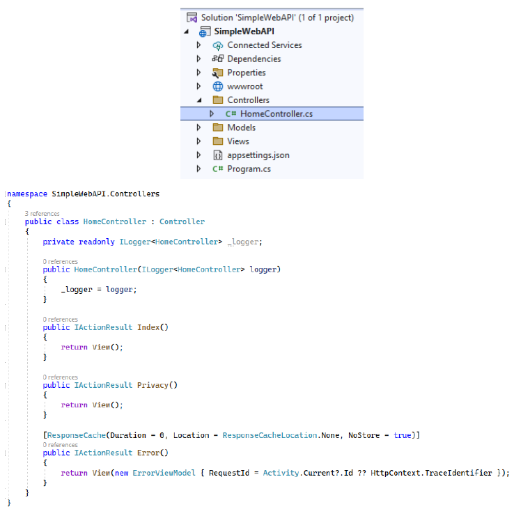
#### Crop the view of image<Image src='https://wikiassets.imindlabs.com.au/assets/4_dev/5_distcomp/1_net_distcomp/mvc/MVC_defaultHomeController.png' alt="ASP.NET MVC default home controller." inferSize style="object-fit: none; object-position: 0 390%;"/>
Crop the view of image
10. Picture
Use the built-in <Picture /> Astro component to display a responsive image with multiple formats and/or sizes.
import { Picture } from 'astro:assets';
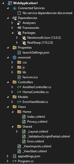
<Picture src='https://wikiassets.imindlabs.com.au/assets/4_dev/5_distcomp/1_net_distcomp/mvc/MVC_default_project.png' pictureAttributes={{class:".text-align-center"}} class="img-style" alt="ASP.NET MVC default project." inferSize/>pictureAttributes
An object of attributes to be added to the <picture> tag.
Use this property to apply attributes to the outer <picture> element itself. Attributes applied to the <Picture /> component directly will apply to the inner <img> element, except for those used for image transformation.
Ref: https://docs.astro.build/en/guides/images/
11. Links
11.1 Link Cards
import { Card, LinkCard, CardGrid } from '@astrojs/starlight/components';
<LinkCard  title="Customizing Starlight"  description="Learn how to make your Starlight site your own with custom styles, fonts, and more."  href="/guides/customization/"/>
<CardGrid>  <LinkCard title="Authoring Markdown" href="/guides/authoring-content/" />  <LinkCard title="Components" href="/guides/components/" /></CardGrid>
<CardGrid>  <Card title="Check this out" icon="open-book">    Interesting content you want to highlight.  </Card>  <Card title="Other feature" icon="information">    More information you want to share.  </Card></CardGrid>
Customizing Starlight Learn how to make your Starlight site your own with custom styles, fonts, and more.
Check this out
Interesting content you want to highlight.
Other feature
More information you want to share.
11.2 Link Button
import { LinkButton } from '@astrojs/starlight/components';
<LinkButton href="/getting-started/">Get started</LinkButton><LinkButton href="/reference/configuration/" variant="secondary"> Configuration Reference</LinkButton><LinkButton href="https://docs.astro.build" variant="secondary" icon="external"> Related: Astro</LinkButton><LinkButton href="https://docs.astro.build" variant="secondary" icon="external" iconPlacement="start"> Related: Astro</LinkButton><LinkButton href="https://docs.astro.build" variant="secondary" icon="external" iconPlacement="start" class='link-btn-external'> Related: Astro</LinkButton>Configuration Reference
Related: Astro
Related: Astro
12. Navigation
Navigation link badges https://starlight.astro.build/guides/sidebar/#autogenerated-groups
Hyper Links
to the same page TEST
to an another page in the same documentation TEST